Back to Blog
Creative Strategy10 min read

10 Great DTC Meta Ads With Links: Hooks, Offers, and Formats to Borrow

10 real DTC Meta ads with links, plus the hand-tagged hook + angle fingerprint for each brand’s currently-active portfolio — backed by 4,994 hand-tagged ads across 364 DTC brands.

B
BrandMov TeamMar 15, 2026 · updated May 9, 2026 · brandmov.com

Most DTC brands do not lose on Meta because they picked the wrong campaign setting.

They lose because their creative looks like everything else in the feed.

The best Meta ads tend to get four things right at once:

  1. The hook — what earns the scroll stop (sale, in-30-seconds, ever-tried-noticed, personal-story, …)
  2. The angle — the scaffolding the body of the ad hangs on (benefit-stack, feature-breakdown, social-proof, science-explainer, …)
  3. The offer — what gives the ad teeth
  4. The format — what makes the idea easy to consume fast

Our editorial team now hand-tags every active ad in the DTC swipe file by hook and angle — same taxonomy across all 364 brands, so the comparisons are apples-to-apples. That means for every brand below we can show you not just what one ad is doing, but what their whole active portfolio looks like as a hook×angle fingerprint. That is the new bit in this update.

So instead of another fluffy “best Facebook ads” list with zero links and a lot of fake marketing wisdom, here’s a tighter version: real DTC brands, links straight to their live ads, and a quick teardown of what each ad is doing.

A quick note: individual Meta ads get rotated in and out constantly, so single-ad URLs often 404 within weeks. Each link below opens the brand’s live ad page on BrandMov so you’ll always see what is running right now.


364DTC brands in our swipe file
4,994Active ads our editorial team has hand-tagged by hook + angle
85%of those ads use one of just two angles ( see them )

The bigger picture: what 4,994 hand-tagged DTC ads actually look like

The 10 brands below aren’t outliers. They sit inside a much wider pattern that becomes obvious once you tag every active ad in the curated swipe file with a hook and an angle. Our editorial team did exactly that across early May 2026, hand-tagging 4,994 currently-running DTC ads against a fixed taxonomy of 26 hooks and 12 angles. Three things jumped out:

  • One angle owns the entire category. The benefit-stack angle — multiple benefits stacked back-to-back, often in a 30-second video — appears in 69% of all tagged ads (3,423 of 4,994). Add the feature-breakdown angle (16%) and you’ve covered 85% of the entire DTC creative output. The remaining 15% (social proof, science explainer, “we’re not cheap,” swap-this-for-that, personal testimonial, weekly plan) is where almost all the differentiation lives. That’s the entire reason we built the “Distinctive only” filter on /swipe.
  • Hooks are more concentrated than people think. Just four hook templates — sale (970 ads), feature-breakdown (845), in-30-seconds (711), and ever-tried-noticed (648) — account for 63% of every tagged DTC ad. If you’ve ever felt like every Meta ad sounds the same, this is why: most brands are picking from the same 4–5 openers and rotating the visuals.
  • The strongest portfolios are template machines, not snowflake creatives. When you look at individual brand portfolios, the winners aren’t producing 50 different ideas — they’re producing 50 variants of one idea. AG1 runs 59% of its active US ads on a single hook + angle template. Magic Spoon runs 45% on the same template. MaryRuth Organics: 50% on one template, 18% on a second. The auction rewards depth on a working template, not breadth across mediocre ones.

That third point is the quiet finding. The four most concentrated portfolios in our 10-brand cut — AG1, Magic Spoon, Dr. Squatch, MaryRuth Organics — have all locked onto a 1–2 template formula and are scaling it with variants. The portfolios that look the most “creative” (Ruggable’s 130 demo videos, Warby Parker’s 17 image-first carousels) actually run the lowest-text formats that fall outside our text-based taxonomy — which is its own kind of repeatable template.


1) Offer-led ads

These ads lead with a sale, discount, bundle, or urgency angle. Not subtle. Also not stupid.

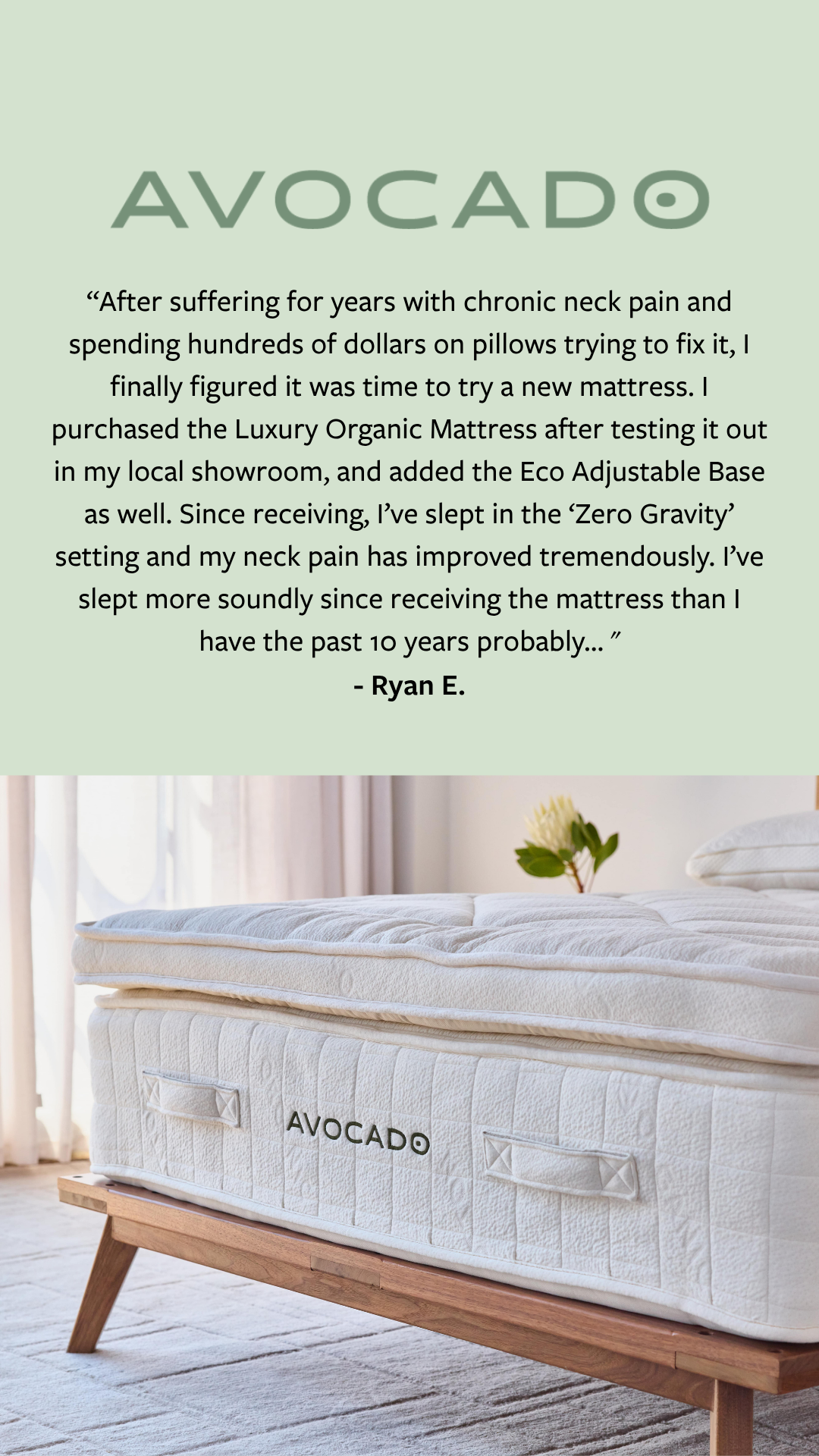
1. Avocado Green Mattress

Sleep / Mattresses

Premium organic-certified mattresses, bedding, and furniture with a sustainability-first brand position.

See Avocado Green Mattress’s active Meta ads

Company: Premium organic-certified mattresses, bedding, and furniture with a sustainability-first brand position.

  • Hook: Sale framed against a premium price anchor
  • Offer: % off sitewide, often anchored against the original “not cheap” price
  • Best format to test: Static image with price stack, plus longer feature-breakdown variants
  • Why it works: Avocado has a high price ceiling. The ad does not pretend the mattress is cheap. It uses the discount to compress the gap between premium positioning and clickable price.

Portfolio fingerprint (live data): Of 86 active US ads, the dominant tagged pattern is feature-breakdown × benefit-stack, with 3 sale ads using a “we’re not cheap” angle that explicitly leans into the premium price as the reason to act now.

Takeaway: If your product is genuinely premium, do not hide the price. Use the offer to make the premium feel earnable, not awkward.

2. Bonobos

Menswear / Apparel

Men’s apparel brand that built modern DTC tailoring and fit online.

See Bonobos’s active Meta ads

Company: Men’s apparel brand that built modern DTC tailoring and fit online.

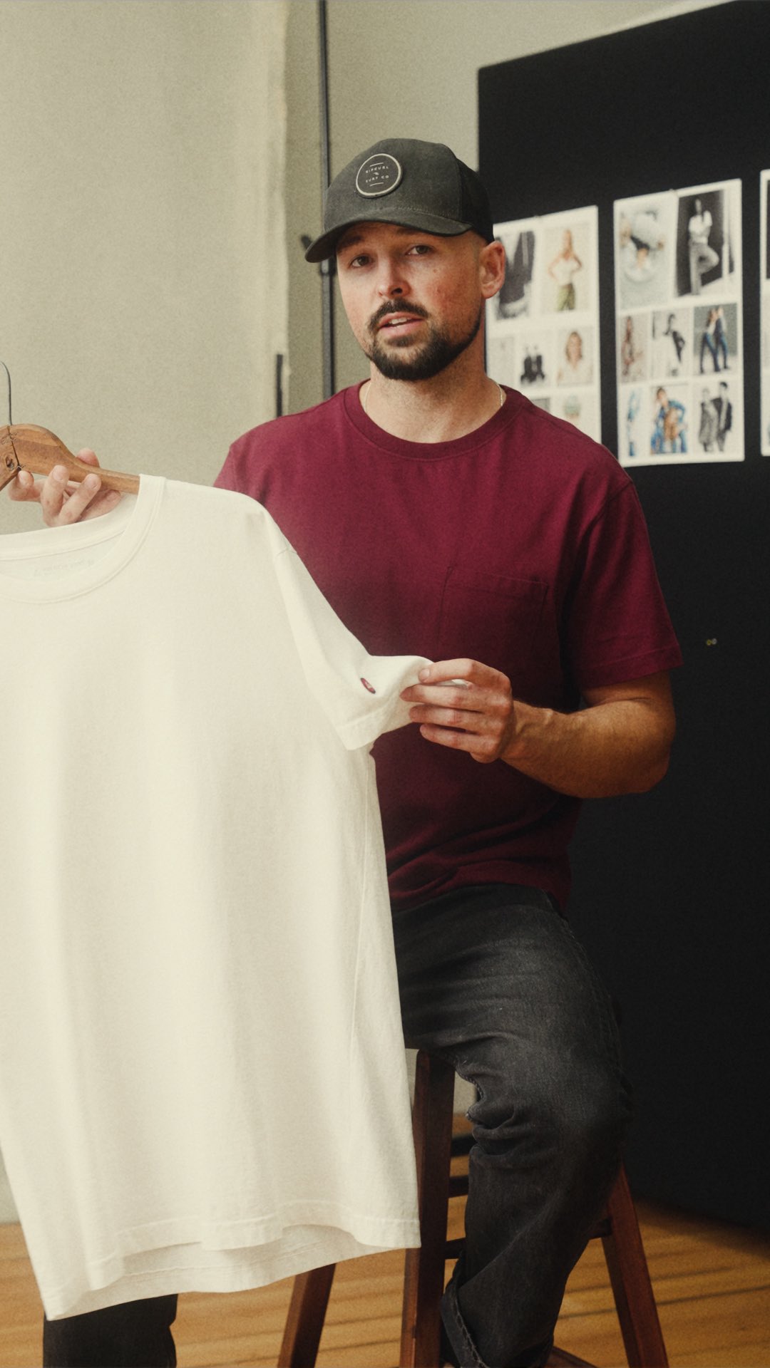
  • Hook: Customer/founder story that ladders into a buy
  • Offer: Sitewide savings + free shipping threshold, often introduced after a personal frame
  • Best format to test: Personal-story carousel or short video, with the offer revealed near the end
  • Why it works: Bonobos has 15+ years of brand equity in fit. The ads do not start with a price slap — they open with a guy talking about why these pants finally worked, then the offer makes the click feel like a low-risk experiment.

Portfolio fingerprint (live data): 40% of Bonobos’ 10 active US ads use the personal-story hook (the highest concentration of personal-story creative in our 10-brand cut), and 90% pair it with the benefit-stack angle.

Takeaway: For a mature DTC brand, story-led framing can outperform a cold price hammer because it earns the right to discount.

3. Warby Parker
Eyewear

Eyewear brand built around vision, purpose, and style.

See Warby Parker’s active Meta ads

Company: Eyewear brand built around vision, purpose, and style.

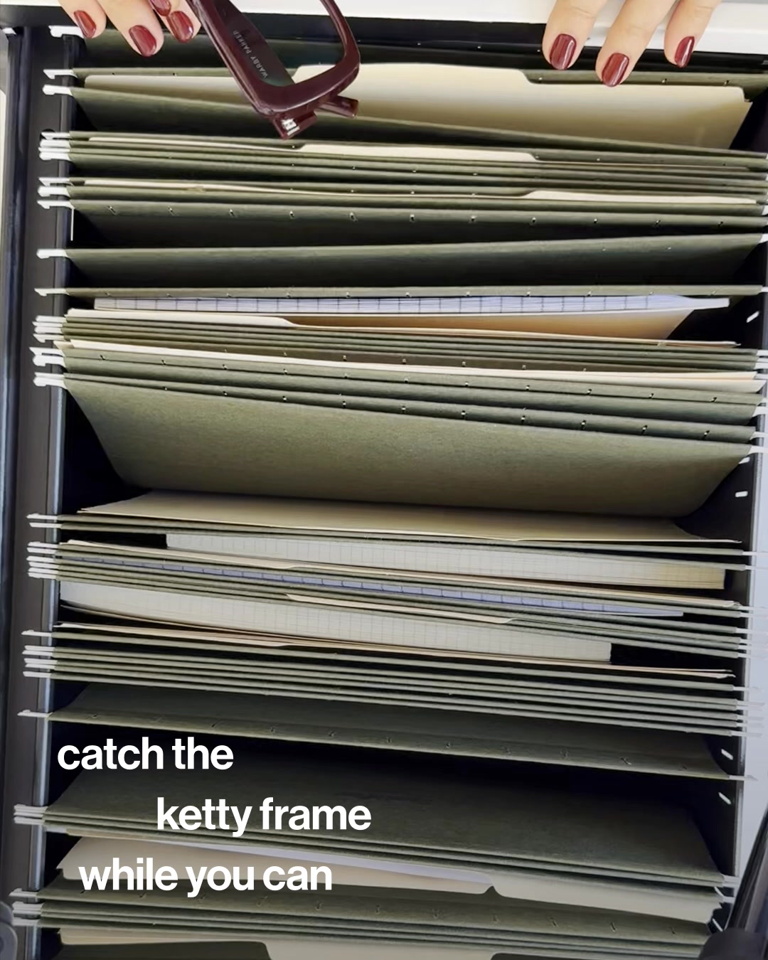
  • Hook: “Best savings ever” style positioning
  • Offer: Limited-time savings
  • Best format to test: Carousel showing multiple hero products
  • Why it works: Glasses are visual and choice-heavy. Offer-led ads work better when the user can immediately browse multiple frame options instead of landing on one generic hero image.

Portfolio fingerprint (live data): All 17 active US ads sit outside our hook + angle taxonomy — a recurring signal that a brand leans on visual carousels and minimal copy. There just isn’t enough text to tag; Warby’s ads are deliberately image-first.

Takeaway: If your catalog has a lot of variety, your offer should be paired with a format that helps people browse, not guess.

Sale is the most-used opener across all 4,994 hand-tagged DTC ads — 19% of the entire swipe file. Browse the live offer-led cluster across 364 brands →


2) Product-led ads

These ads win by making the product itself feel obvious, useful, or hard to ignore.

4. Ruggable

Home / Rugs

Washable rugs designed to be nonslip, durable, and stain-resistant.

See Ruggable’s active Meta ads

Company: Washable rugs designed to be nonslip, durable, and stain-resistant.

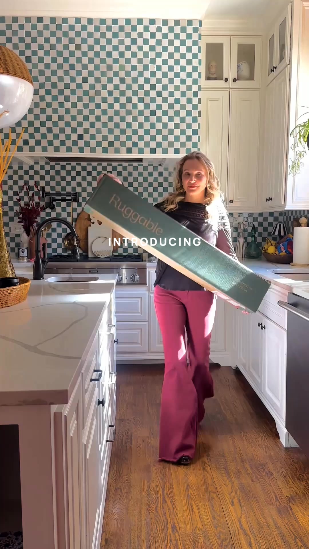
  • Hook: “Meet All-in-One” product launch framing
  • Offer: Product innovation rather than price discount
  • Best format to test: Demo video
  • Why it works: The product is the story. When the product solves a familiar pain point in a visibly better way, you do not need a weird angle. You need proof.

Portfolio fingerprint (live data): Ruggable runs the largest active portfolio in our 10-brand set — 130 active US ads — and almost all are demo-led video. Like Warby, our taxonomy rarely catches them, which itself is a signal: the format does the lifting, not the copy.

Takeaway: New product lines often perform best when the ad simply shows what changed and why it matters.

5. HexClad
Home / Cookware

Hybrid stainless + nonstick cookware famously co-signed by Gordon Ramsay.

See HexClad’s active Meta ads

Company: Hybrid stainless + nonstick cookware famously co-signed by Gordon Ramsay.

  • Hook: Celebrity chef social proof + “the secret most pros use” framing
  • Offer: Bundle pricing on cookware sets, occasionally a bestseller discount
  • Best format to test: Endorsement-led video or carousel mixing chef-cred with feature breakdowns
  • Why it works: Cookware is a category where buyers are skeptical of marketing claims. Pulling a famous chef into the hook does the credibility work in two seconds, then the feature breakdown explains why this pan deserves the price.

Portfolio fingerprint (live data): Of 70 active US ads, 26% use the social-proof × benefit-stack pattern (chef endorsements paired with multi-benefit copy) and 16% lead with a “the secret” hook into a feature-breakdown — a very deliberate two-template portfolio.

Takeaway: When your category is full of look-alikes, borrowed authority can close the trust gap faster than another spec sheet.

6. Jones Road Beauty
Beauty

Bobbi Brown’s clean, no-makeup-makeup beauty brand.

See Jones Road Beauty’s active Meta ads

Company: Bobbi Brown’s clean, no-makeup-makeup beauty brand.

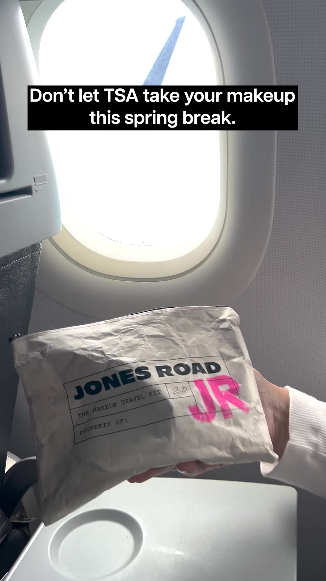
  • Hook: “Miracle Balm is truly a miracle”
  • Offer: Product simplicity and ease of use
  • Best format to test: Short demo video or creator application clip
  • Why it works: Beauty buyers respond well to products that look easy to use and easy to understand. The ad keeps the promise simple: dewy glow, minimal effort, no overthinking.

Portfolio fingerprint (live data): 30% of 40 active US ads use feature-breakdown × benefit-stack and another 15% use a now-available hook into benefit-stack — a portfolio built around constantly re-introducing the hero SKU rather than chasing new angles.

Takeaway: If your product has a strong hero SKU, build around it. One memorable product beats five forgettable ones.

Visually-legible products like Ruggable and HexClad scale to 100+ concurrent variants because the format itself does the lifting. See more product-led creative from 364 DTC brands →


3) Benefit-led ads

These ads lead with what the customer gets, not just what the product is.

7. AG1

Health / Supplements

Daily health drink designed to support foundational nutrition and gut health.

See AG1’s active Meta ads

Company: Daily health drink designed to support foundational nutrition and gut health.

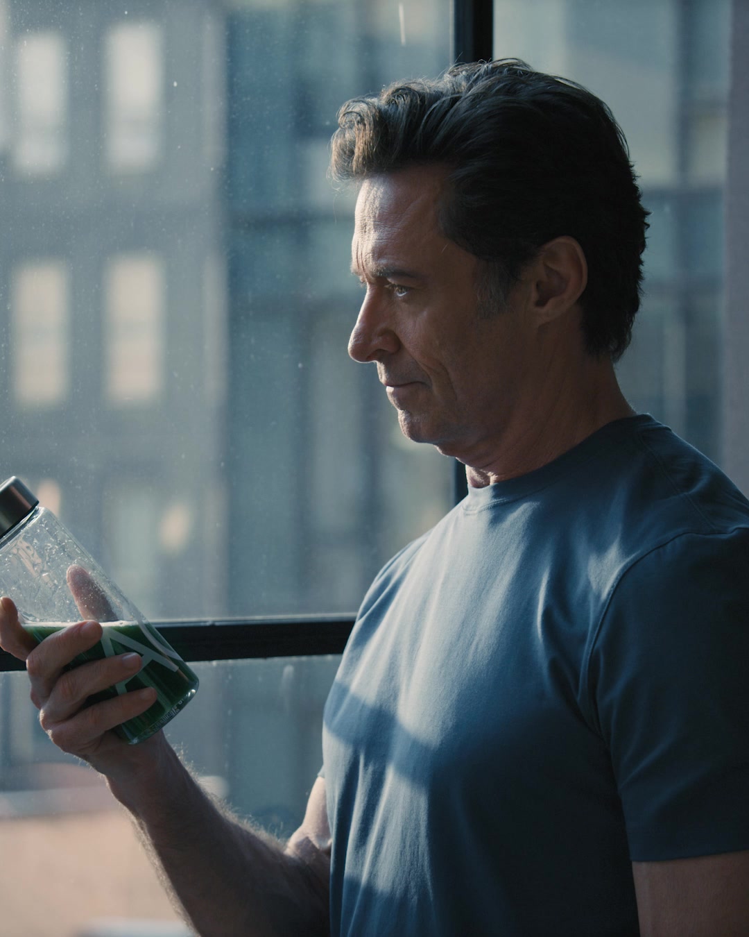
  • Hook: “What happens to your body in 30 seconds” framing
  • Offer: Better daily routine in one scoop
  • Best format to test: Founder or authority-style explainer video, almost always under a minute
  • Why it works: It reframes the category before selling the product. The 30-second framing makes the benefit feel immediate and easy to understand, while the benefit stack does the heavy lifting on why this option beats the rest of the supplement aisle.

Portfolio fingerprint (live data): 59% of AG’s 17 active US ads run on the same template: in-30-seconds hook × benefit-stack angle. That is the most concentrated single-template fingerprint in our 10-brand cut — they have found a format that works and they are riding it hard.

Takeaway: If your category is crowded, do not just sell your product. Redefine the standard people should judge the category by, in a format short enough to actually finish.

8. Magic Spoon

Food / Cereal

High-protein, low-sugar cereal built around childhood nostalgia with a modern nutrition angle.

See Magic Spoon’s active Meta ads

Company: High-protein, low-sugar cereal built around childhood nostalgia with a modern nutrition angle.

  • Hook: “Why would you ever eat regular cereal again?”
  • Offer: Nostalgia without the nutritional guilt
  • Best format to test: 30-second explainer or creator taste-test, with a sale variant on rotation
  • Why it works: The ad attacks the old default instead of politely asking for attention. That gives it energy. The product becomes the “upgrade,” not just another cereal box.

Portfolio fingerprint (live data): 45% of Magic Spoon’s 33 active US ads use the in-30-seconds × benefit-stack template (the same one AG1 leans on), and a further 30% are sale or now-available variants — also benefit-stack. 100% of their tagged ads use the benefit-stack angle.

Takeaway: A great hook can sell against the category incumbent, not just for your own product.

9. Dr. Squatch

Personal Care

Natural soap and personal-care brand for men, built on humour and “made for men, not chemists” positioning.

See Dr. Squatch’s active Meta ads

Company: Natural soap and personal-care brand for men, built on humour and “made for men, not chemists” positioning.

  • Hook: Sale framing, almost always over social proof
  • Offer: % off bestsellers, bundle pricing, free-gift thresholds
  • Best format to test: Short video with strong character voice + reviewer/customer reaction overlays
  • Why it works: Personal care for men is a category most brands treat as boring. Dr. Squatch leans into voice and humour, but the actual ad mechanic is unromantic: a sale, framed against social proof so the discount feels earned.

Portfolio fingerprint (live data): 72% of Dr. Squatch’s 65 active US ads use a sale hook — split almost evenly between sale × social-proof (37%) and sale × benefit-stack (35%). One of the most consistently sale-driven portfolios in the swipe file.

Takeaway: Distinctive voice can carry a brand far, but the sustainable conversion lever is still a clear sale + visible social proof.

10. MaryRuth Organics
Health / Supplements

Founder-led liquid supplement brand built around a personal health-recovery story.

See MaryRuth Organics’s active Meta ads

Company: Founder-led liquid supplement brand built around a personal health-recovery story.

  • Hook: Sale, with frequent “ever tried / noticed” problem-aware variants
  • Offer: % off sitewide, bundle deals, subscribe-and-save
  • Best format to test: Founder-voice video or static product image with price stack
  • Why it works: MaryRuth’s story is the long-term moat, but the day-to-day workhorse ad is much simpler: a problem-aware question or a sale, then a benefit stack. The mission earns trust; the offer drives the click.

Portfolio fingerprint (live data): Of 141 active US ads (the largest portfolio in our 10-brand set after Ruggable), 50% are sale × benefit-stack and another 18% are ever-tried-noticed × benefit-stack — a two-template machine where 100% of tagged ads land on benefit-stack.

Takeaway: When you have a strong founder story, do not exhaust it on every ad. Use it to build the brand and let cheaper, more direct creative do the immediate conversion work.

Want to see what these 10 brands — and 354 others — are running this week? The live curated swipe file tracks 364 DTC brands across 11 sectors. Every active ad is hand-tagged with a hook and angle by our editorial team, so you can filter for the 15% of creative that doesn’t use the same benefit-stack template as everyone else. Free to browse, no signup.

“The goal of creative strategy is not to guess what will work. It is to isolate the variables that actually move the needle, and test them as fast as the market changes.”

— BrandMov Strategy Team

What the data actually suggests once you tag every ad

A post like this works better on Reddit when it reads like analysis, not a disguised landing page. So here is the honest version of the research, this time with the editorial tagging doing the bookkeeping instead of vibes.

This is still a directional read, not a universal law of DTC Meta performance. About 26% of all DTC ads sit outside our hook + angle taxonomy because they’re image-first or low-text (Ruggable and Warby Parker are textbook examples). Read the patterns below as “here’s what shows up when we measure 4,994 ads,” not as a sermon.

1. Offer-led ads dominate mature, repeat-purchase categories

Avocado Green Mattress, Bonobos, and Warby Parker all lean on some version of savings, urgency, or promotional framing. That makes sense. In categories where buyers already understand the product, the ad does not need to educate as much. It just needs to create a reason to act now.

What this means: if your category is already familiar, the creative battle is often less about explanation and more about timing, merchandising, and perceived value.

Backed by the data: the “sale” hook is the single most-used opener in the swipe file — 970 of 4,994 hand-tagged ads (19%). It dominates personal-care and supplements (Dr. Squatch, MaryRuth) and shows up as a meaningful share in apparel and home (Bonobos, Avocado, True Classic). Premium brands rarely drop the offer hook entirely; they just frame it differently — Avocado’s sale ads pair the discount with a “we’re not cheap” angle so the promo doesn’t cheapen the brand.

2. Product-led ads work best when the product improvement is easy to show

Ruggable, HexClad, and Jones Road do not need complicated copy. Their ads work because the product story is visually legible. Washable rugs, better-performing pans, easy beauty application — these things compress well into feed-native creative.

What this means: if your product benefit is visible in under three seconds, lead with the product. If it takes a paragraph to explain, the ad probably needs a different angle.

Backed by the data: Ruggable runs 130 active US ads and almost none of them sit inside our hook + angle taxonomy — the format is video-demo first, copy a distant second. Warby Parker has the same fingerprint at lower volume (17 ads, all untagged). Visually-legible products get rewarded with more concurrent variants because the format itself does so much of the lifting; the copy doesn’t have to.

3. The strongest benefit-led ads run a 1–2 template machine

AG1 and Magic Spoon are not just describing their products — they’re reframing the default alternative. But the more interesting finding is that they do almost all of it on the same template. AG1 runs 59% of its active US ads on the in-30-seconds hook + benefit-stack angle. Magic Spoon runs 45% on that same template. Dr. Squatch goes even further: 72% of its 65 active ads use a sale hook, split across two angles.

What this means: the goal of creative testing is not infinite variety. It is finding a template that converts and then producing 30 variants of it. The auction rewards depth on a working pattern more than it rewards novelty.

Backed by the data: the four most concentrated portfolios in our 10-brand cut are all benefit-led, and all four use benefit-stack as their primary angle — AG1 (59% on one template), Magic Spoon (45%), MaryRuth Organics (50% + 18% on a second template), Dr. Squatch (72% on a sale hook). The benefit-stack angle accounts for 69% of all hand-tagged DTC ads for a reason: it’s the most reliable scaffolding for variant production.

4. Most ads use the same two angles — differentiation lives in the other 15%

Across 4,994 hand-tagged DTC ads, 85% use either benefit-stack or feature-breakdown as their angle. The other 15% — social proof, science explainer, “we’re not cheap,” swap-this-for-that, personal testimonial, weekly plan — is where almost every brand we’d call distinctive shows up.

What this means: if your ads feel forgettable, the problem is rarely the hook. It’s usually the angle. Switching from benefit-stack to a different scaffolding (HexClad’s social-proof × benefit-stack, Avocado’s “we’re not cheap,” Dermalogica’s science-explainer) is one of the cheapest ways to escape feed sameness.

5. Story-led hooks earn the right to discount

Bonobos and MaryRuth both lean into personal/founder story as a setup for the offer that follows. Bonobos uses personal-story in 40% of its (small) active portfolio — the highest concentration of personal-story creative in our 10-brand cut. MaryRuth uses ever-tried-noticed (a problem-aware variant of personal story) on 18% of its 141 ads.

What this means: story doesn’t need to live in its own ad — it can be the first 5 seconds of an ad whose last 5 seconds is a sale. That sequencing is what makes the discount feel earned instead of desperate.


What I would look at next if I were doing this more seriously

This is the part most “ad inspiration” posts skip. If you want this kind of research to be actually useful, the next step is not collecting more random ads. It is making the sample more structured.

  • Look at hook + angle distribution per brand, not per ad. One ad can be an outlier. The full active portfolio shows you the actual template the brand has settled on.
  • Find the brands hitting 40%+ concentration on a single template. They’ve found their formula and their refresh cadence is mostly variant production. Worth studying.
  • Skip benefit-stack and feature-breakdown when you’re hunting for differentiation. 85% of the feed lives there. The other 15% is where novel angles get built.
  • Group brands by category maturity — supplements and bedding do not behave the same way.
  • Look for refresh cadence — often the best insight is not the ad itself, but how often the brand replaces a template.
  • Check landing page alignment — does the landing page continue the hook + angle promised in the ad?

That kind of structured pattern-spotting is exactly what the curated swipe file now does at scale. Filter by hook, by angle, by sector; combine them; flip on “Distinctive only” to drop the 85% of feed-standard creative; or use “Top picks” for the editorial-score ≥ 0.65 cut.


A practical way to research DTC Meta ads without fooling yourself

If I were turning this into an actual ongoing research process, I would do it like this:

  1. Pick one category at a time — e.g., bedding, supplements, or skincare.
  2. Pull 10–15 brands in that category.
  3. Pull every active ad each brand is running — not just the prettiest 1–2.
  4. Tag each ad by hook and angle (the BrandMov swipe file does this for you, but you can do it manually with the same taxonomy).
  5. Compute the % of each brand’s portfolio on each hook×angle pair. The brands with one 40%+ template are the ones who’ve found something working.
  6. For your own brand, pick the template you want to test against. Either copy the template fingerprint, or pick a deliberately under-used angle from the “other 15%”.

That gives you a view into how a category is actually being sold, which is much more useful than a swipe file full of pretty ads.


Final word

The point of studying great Meta ads is not to copy them line by line. It is to understand the structure underneath them: what made the hook work, what kind of offer made the click easier, and what format made the message easier to consume.

Steal the structure. Not the sentences.

And if you want a real swipe file instead of a graveyard of half-remembered tabs, the live curated swipe file is where 500 brands get watched daily and only the working creatives get through. Filter by sector, save what you like, build your own brief. That is the whole reason BrandMov exists.

Browse the curated DTC swipe file

364 hand-picked DTC brands. Every active ad hand-tagged by hook + angle. Updated daily. Filter for the 15% of creative that doesn’t use the same benefit-stack template as everyone else — no dead ads, no clutter, no signup.

Open the swipe file

Or get email alerts on these 10 brands specifically

The DTC watchlist tracks the 10 brands above and emails you when their Meta ads change. One page, no account needed.

See the watchlist