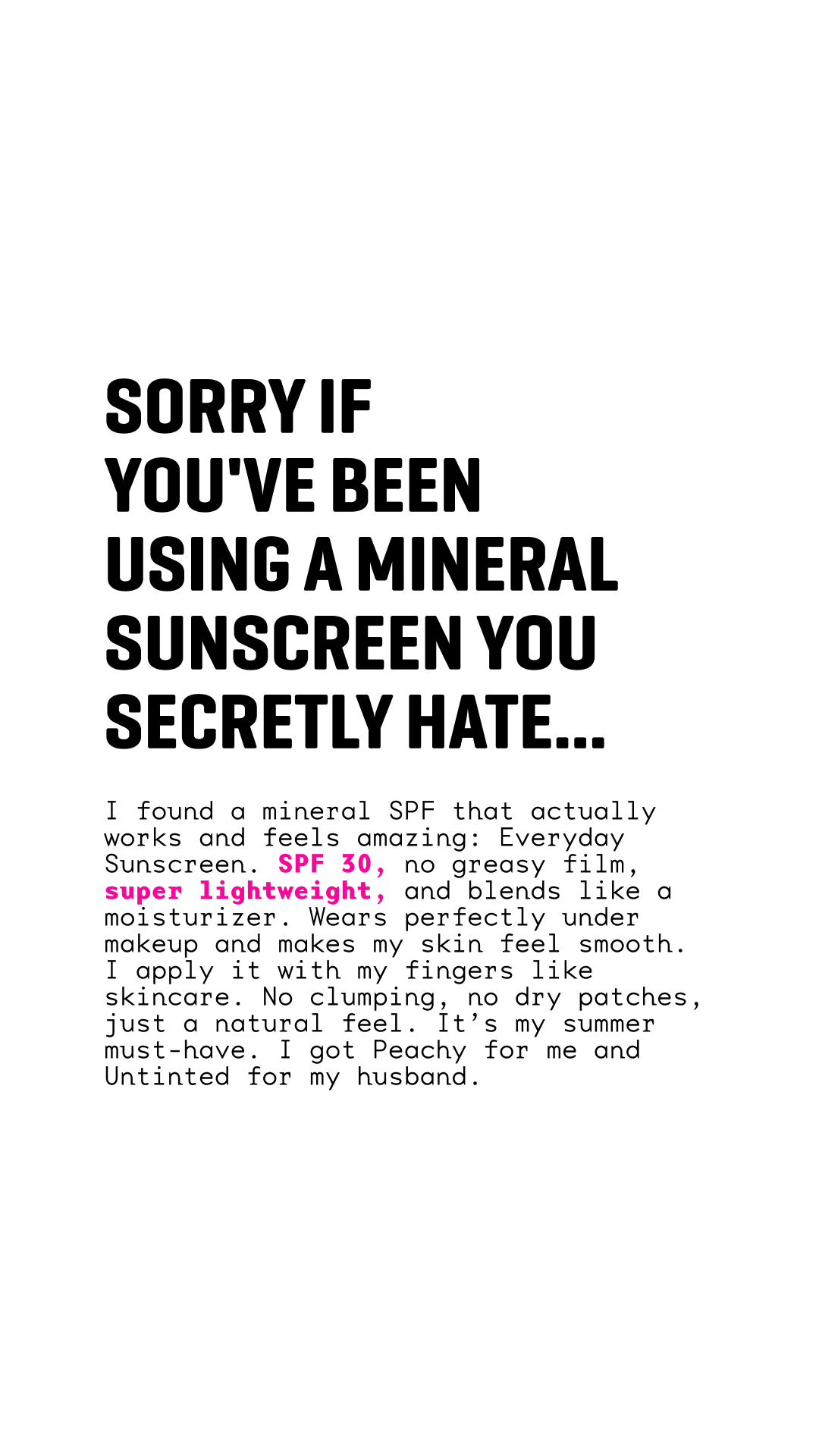
You don’t need video. You need creative that earns the click without asking for 30 seconds of attention up front. Eight live DTC static templates below — pulled from 16,000+ currently-running hand-tagged ads in the curated swipe file. Each section opens with the hook line, then the live creative (single-ad URLs 404 within weeks; the brand page stays fresh).
The 8 live static templates
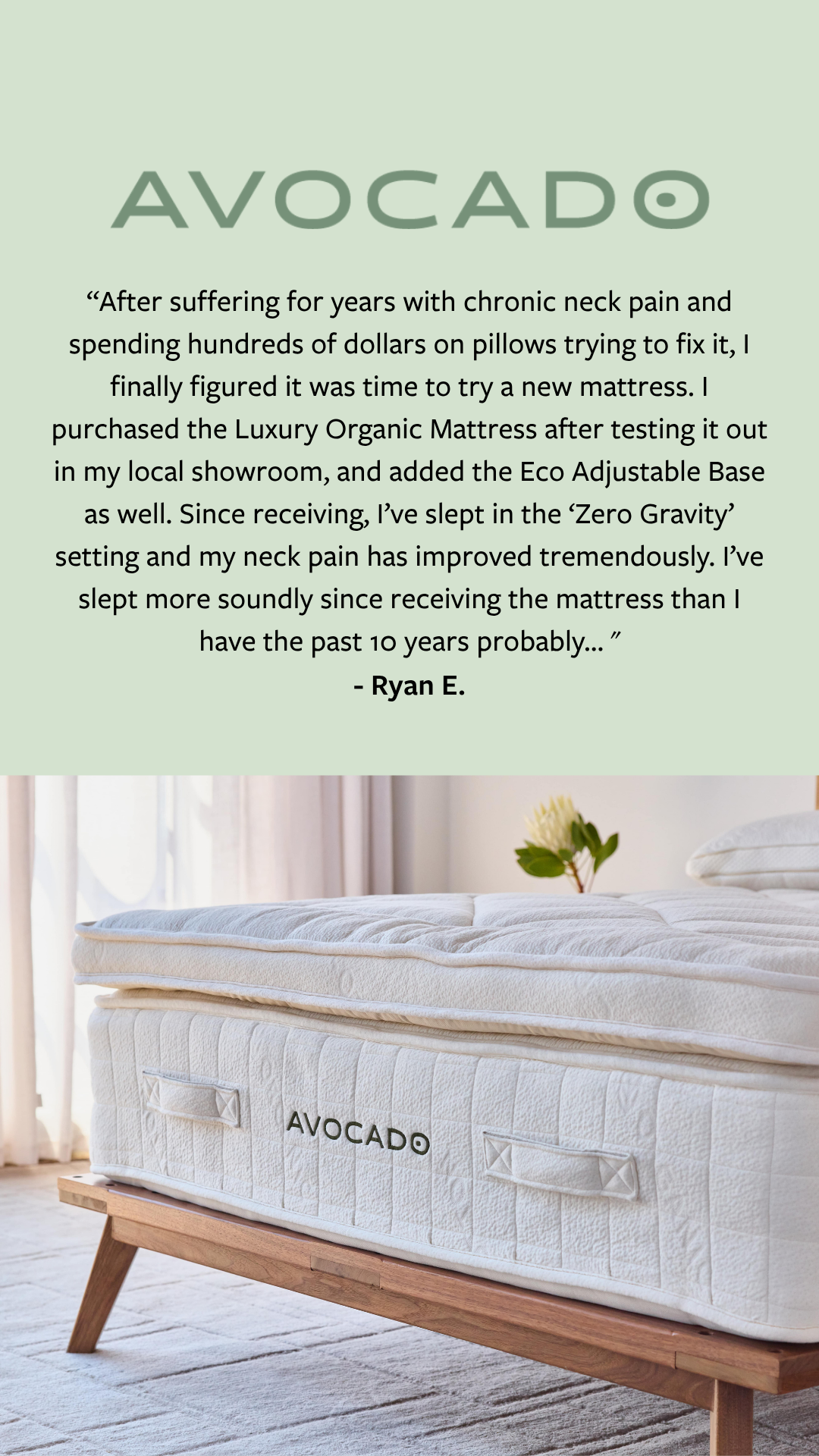
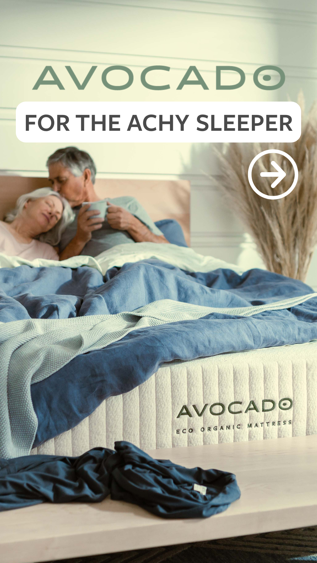
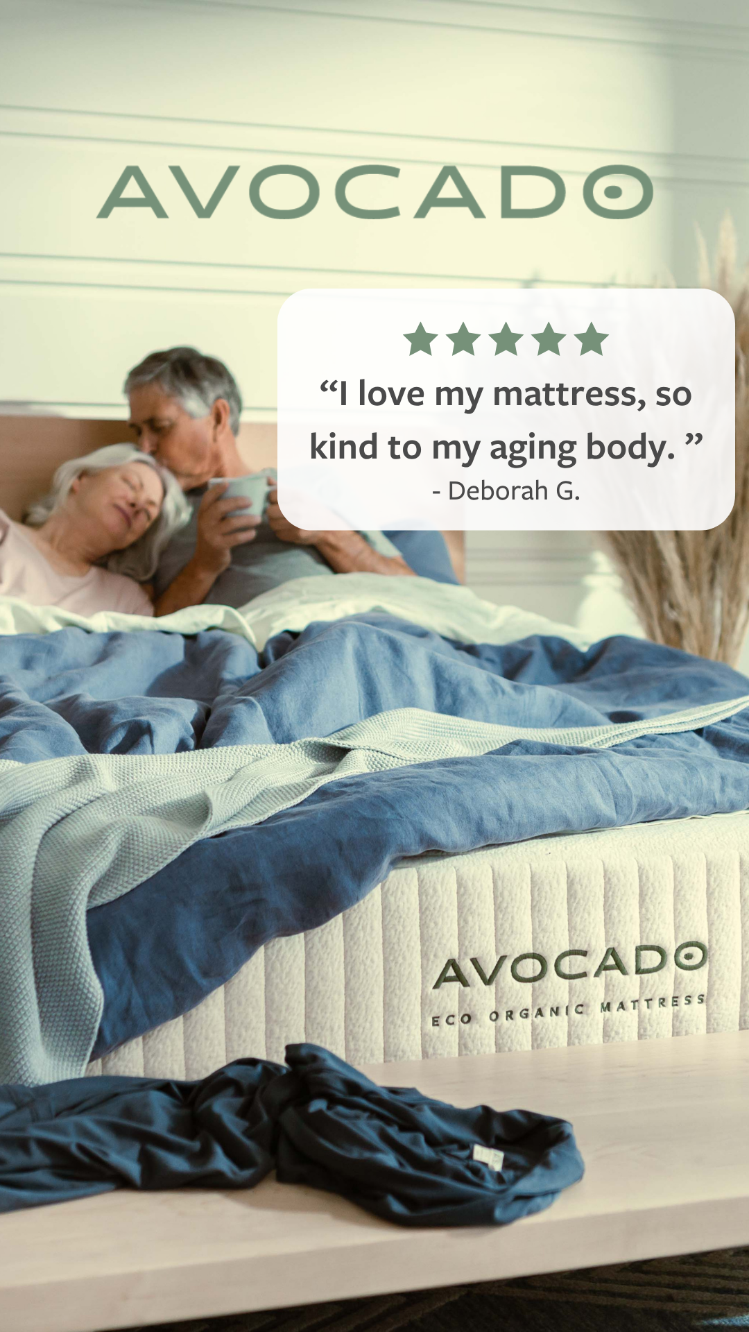
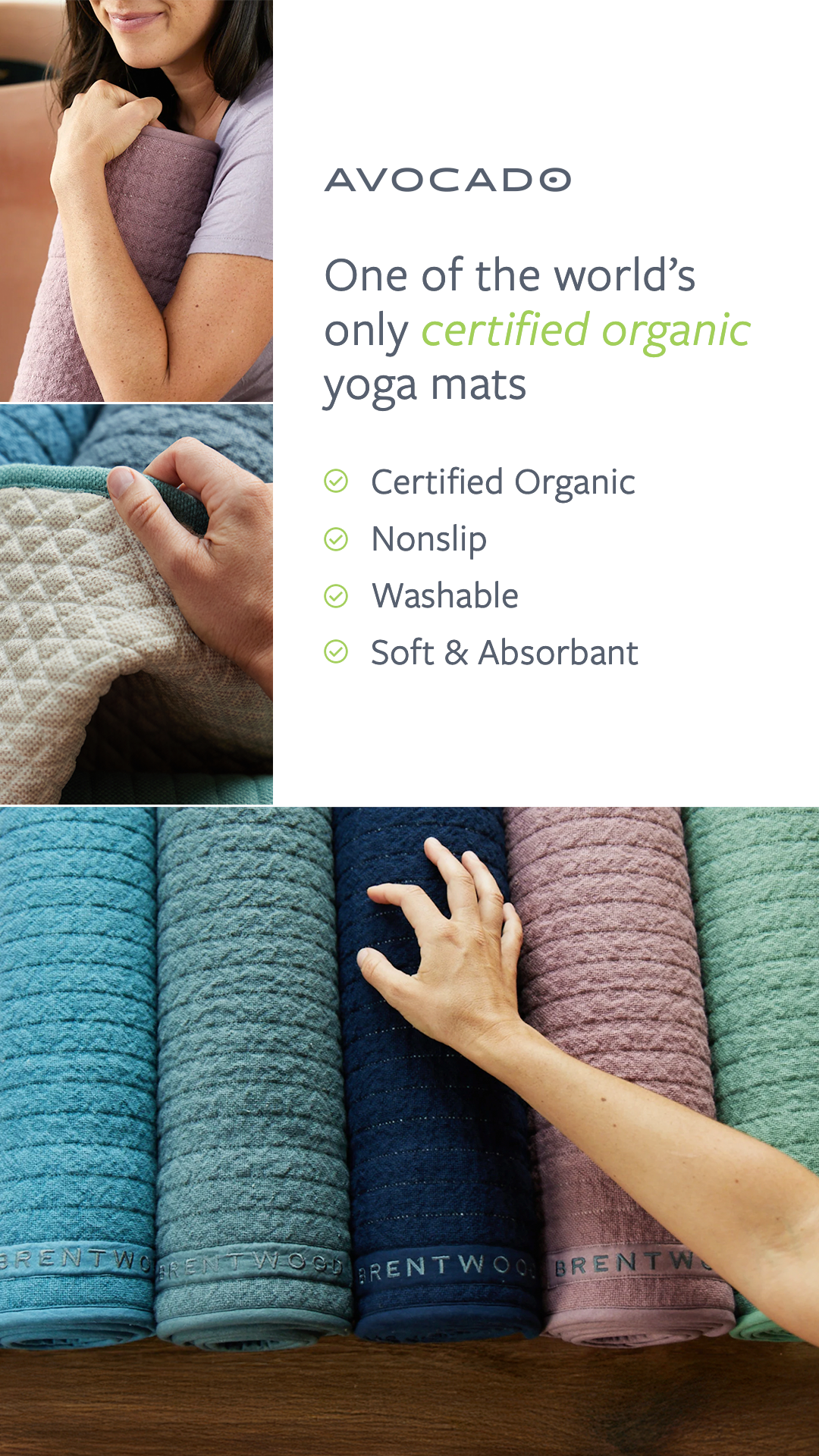
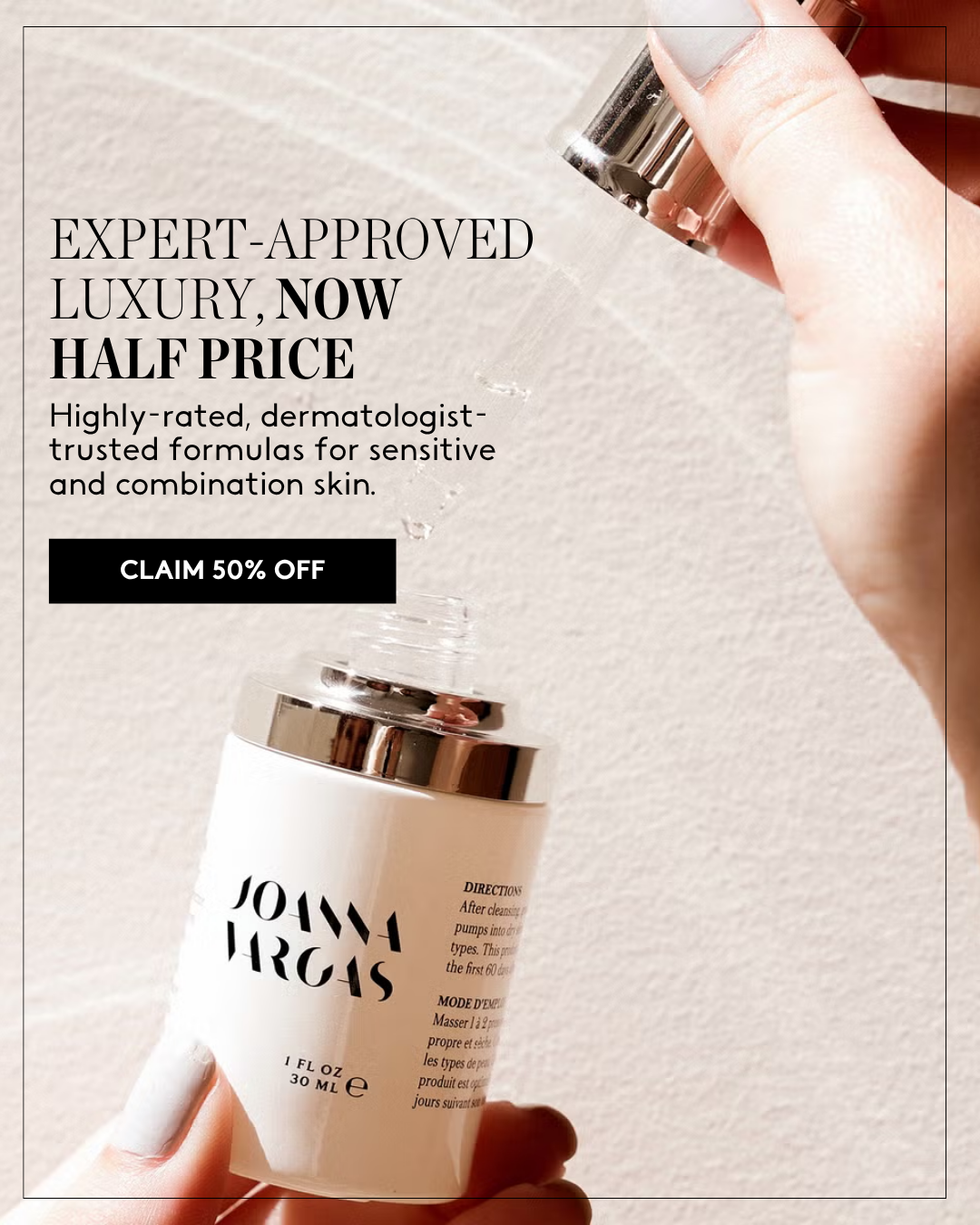
1. Avocado Green Mattress — Static testimonial
“A real customer’s neck-pain story carrying the whole ad.”

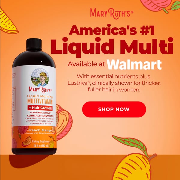
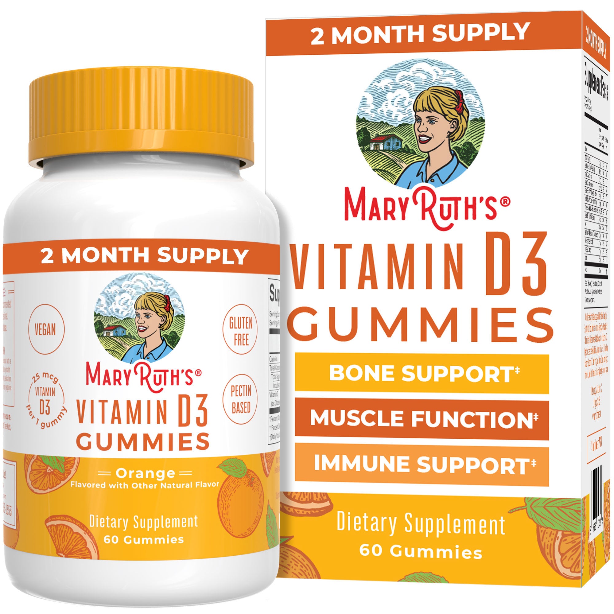
2. MaryRuth Organics — Static retail-distribution
“America’s #1 Liquid Multi. Available at Walmart.”

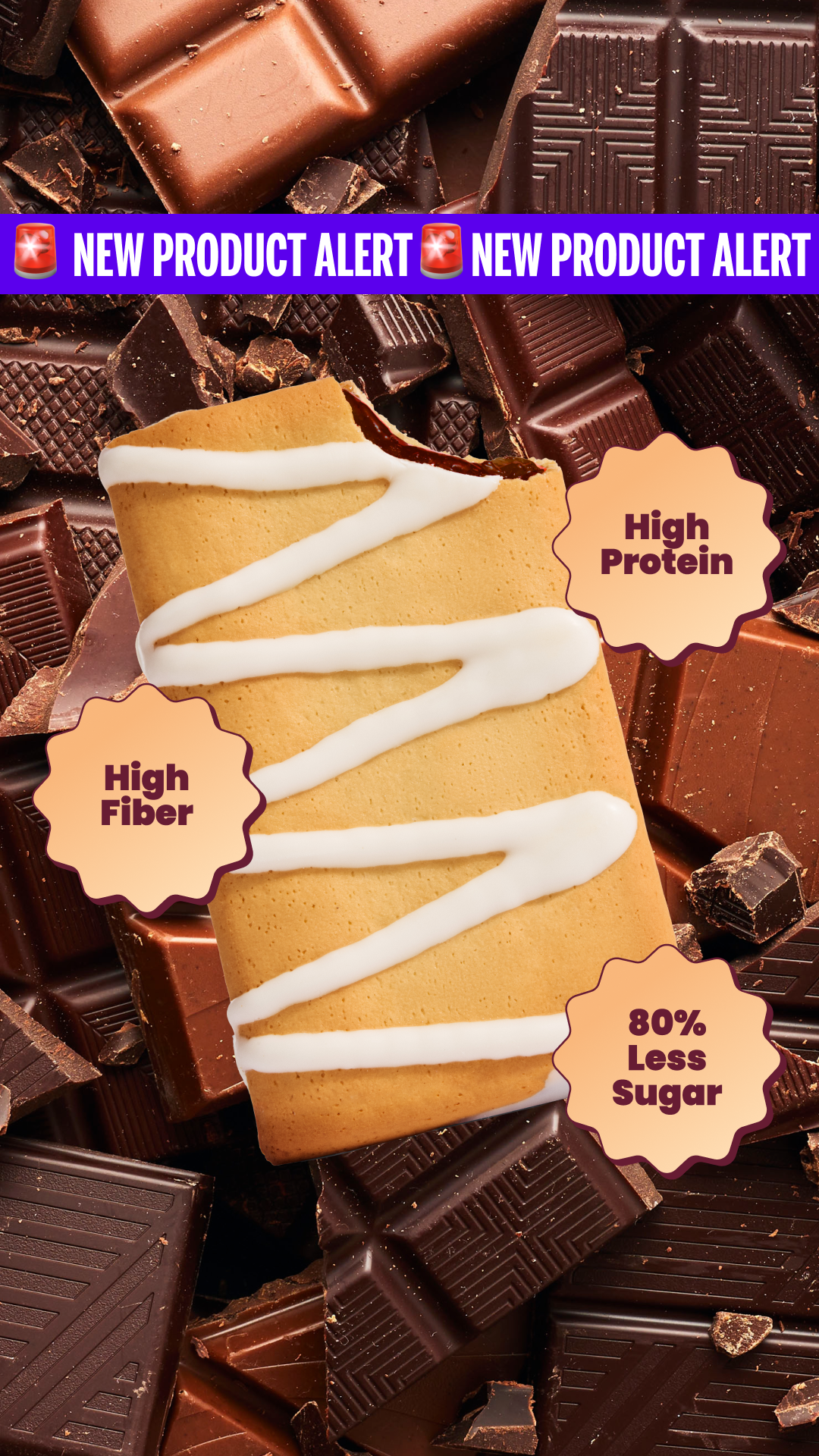
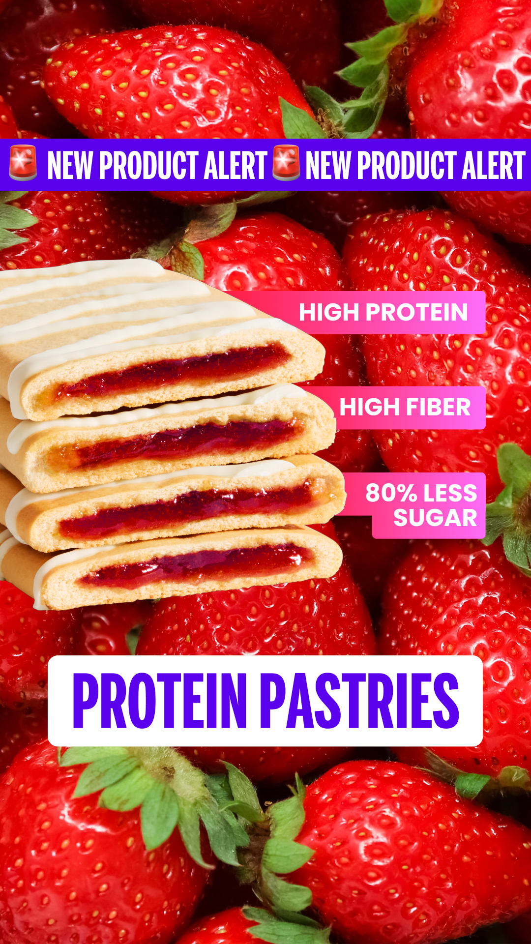
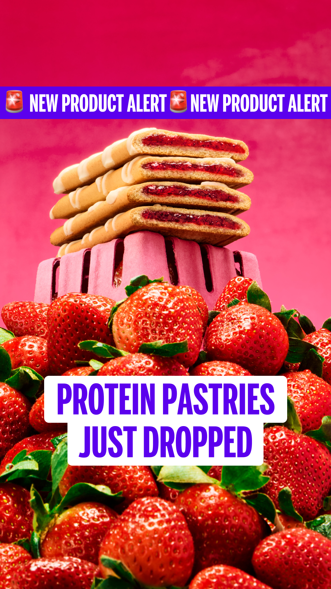
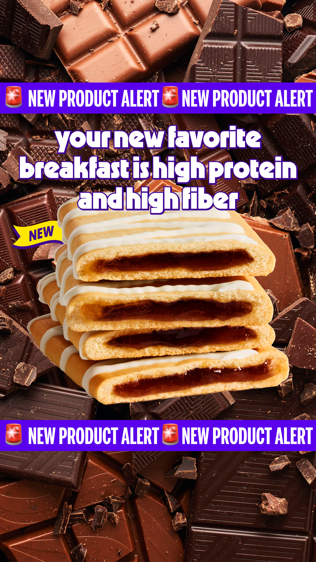
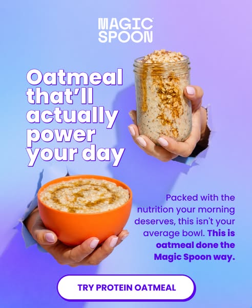
3. Magic Spoon — Static + badge stack
“NEW PRODUCT ALERT 🚨”

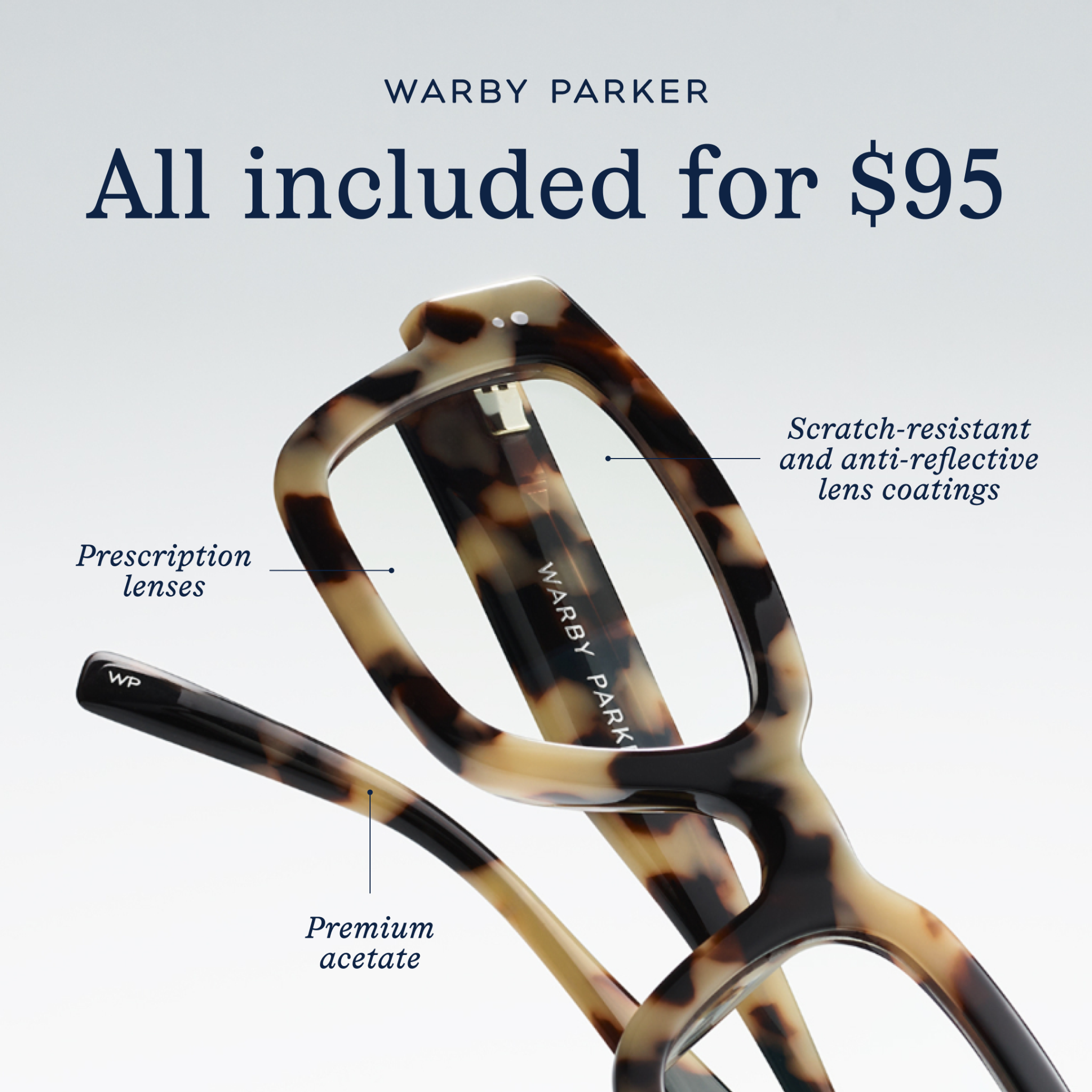
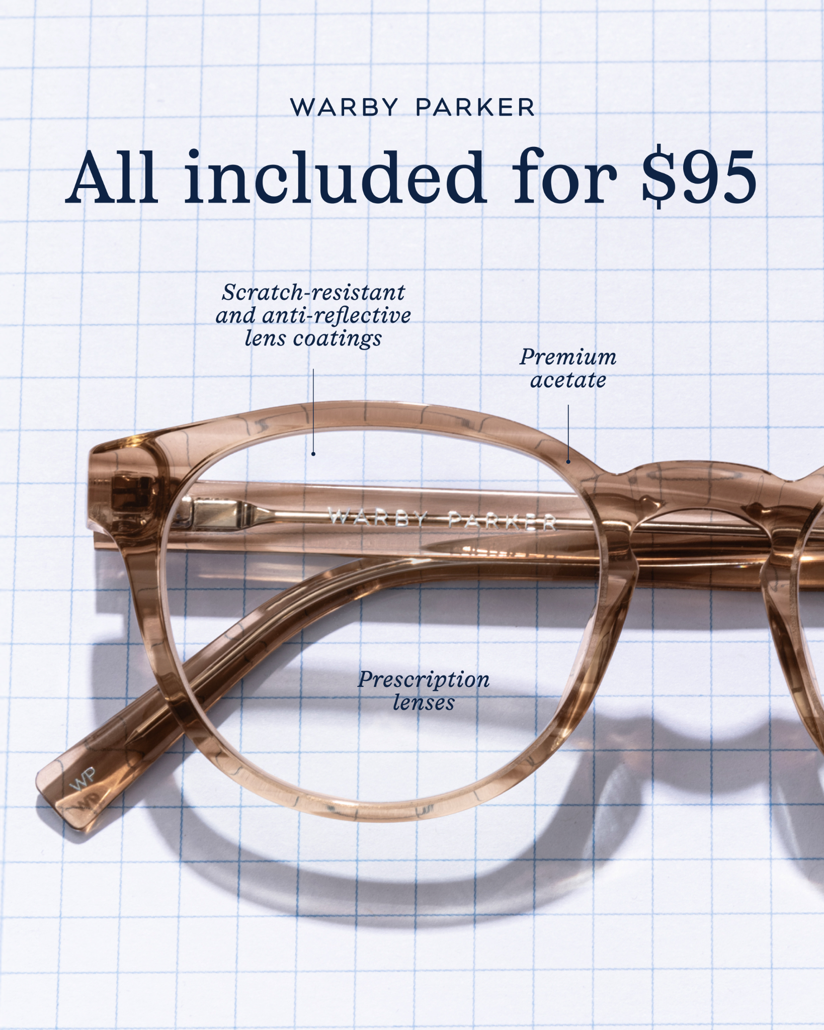
4. Warby Parker — Static annotated specimen
“All included for $95.”


See more live static templates running in market this week
A small slice of the curated swipe file — every ad here is currently in market, hand-tagged by hook + angle. Open the full feed →


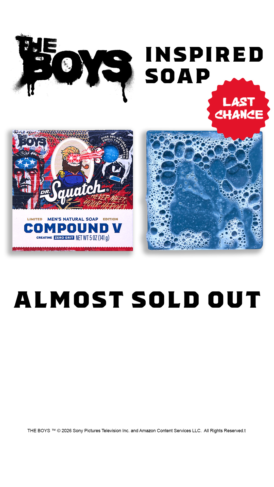
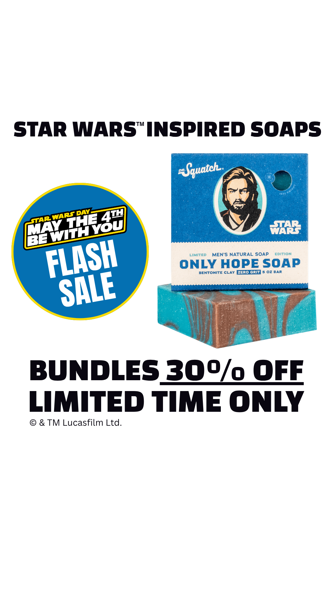
5. Dr. Squatch — Static collab scarcity
“LAST CHANCE. Almost sold out.”

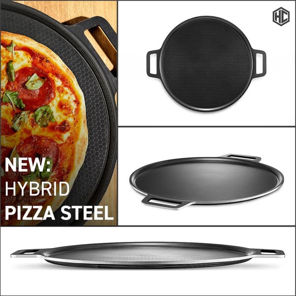
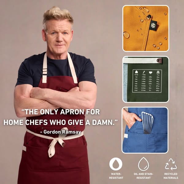
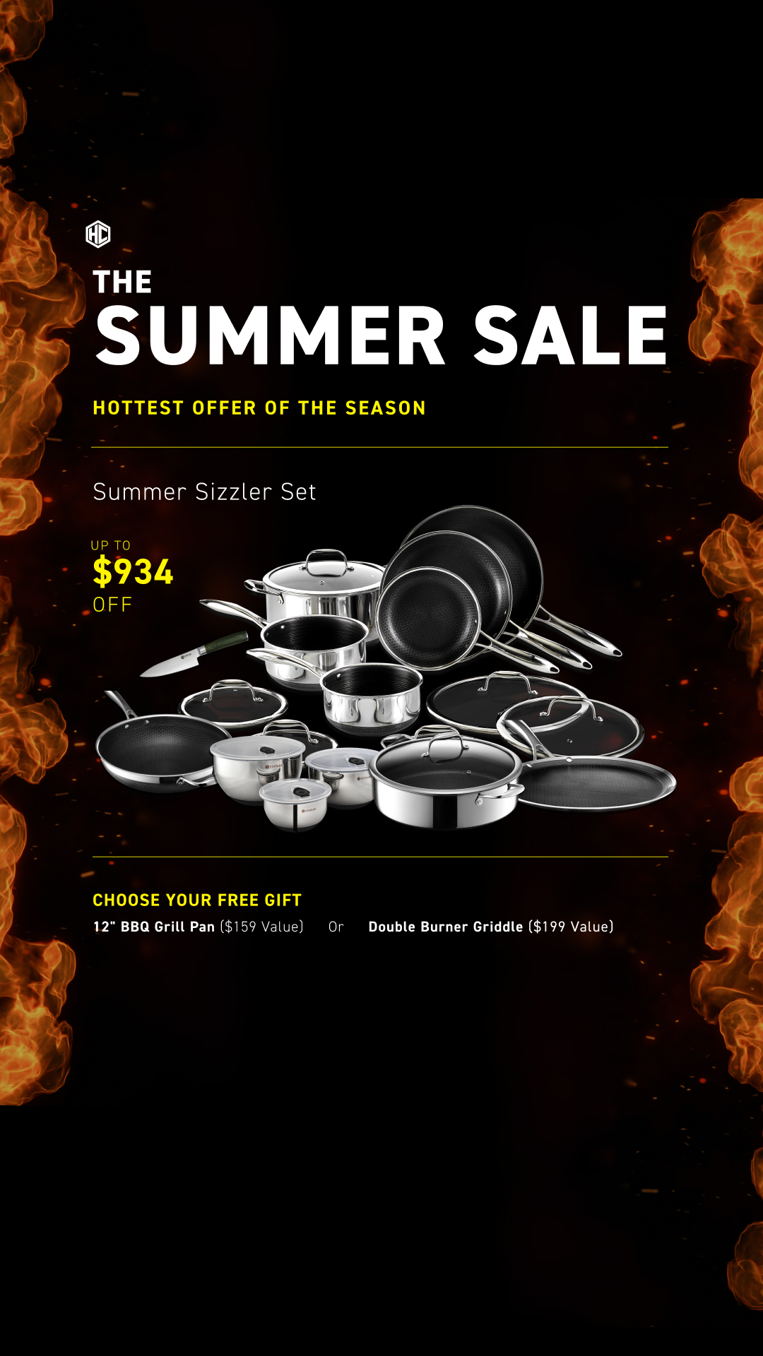
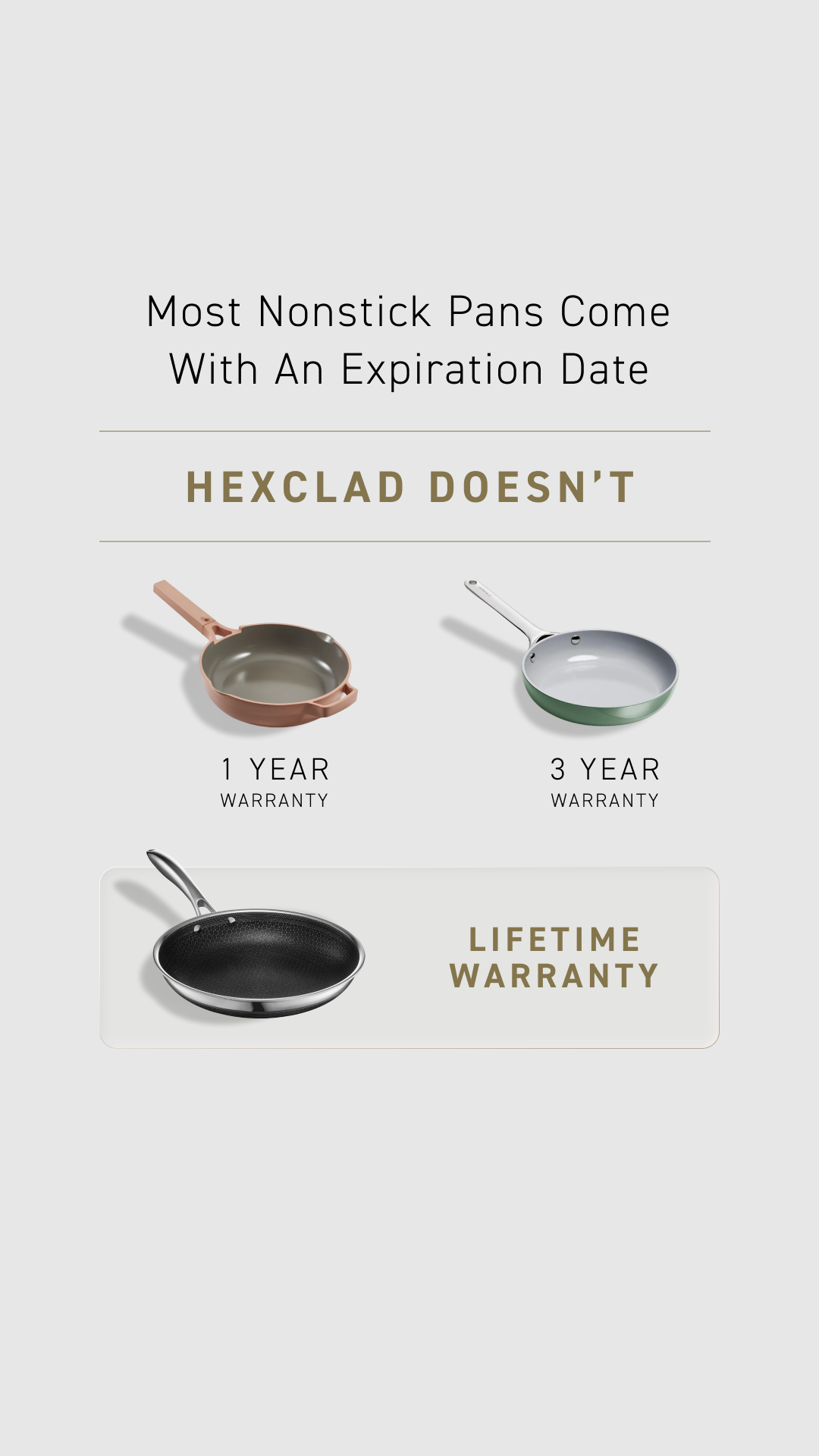
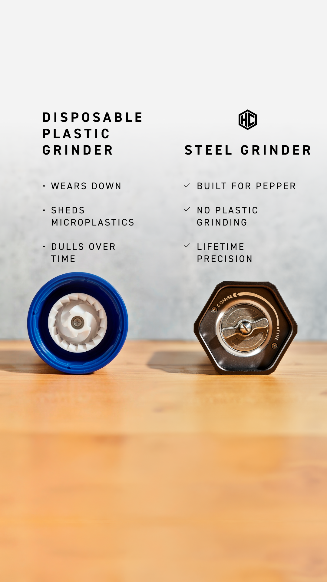
6. HexClad — Static product grid
“NEW: HYBRID PIZZA STEEL.”

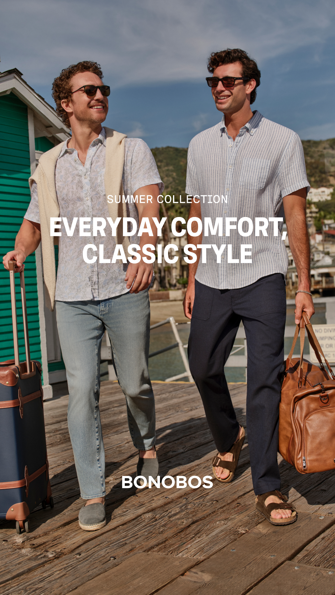
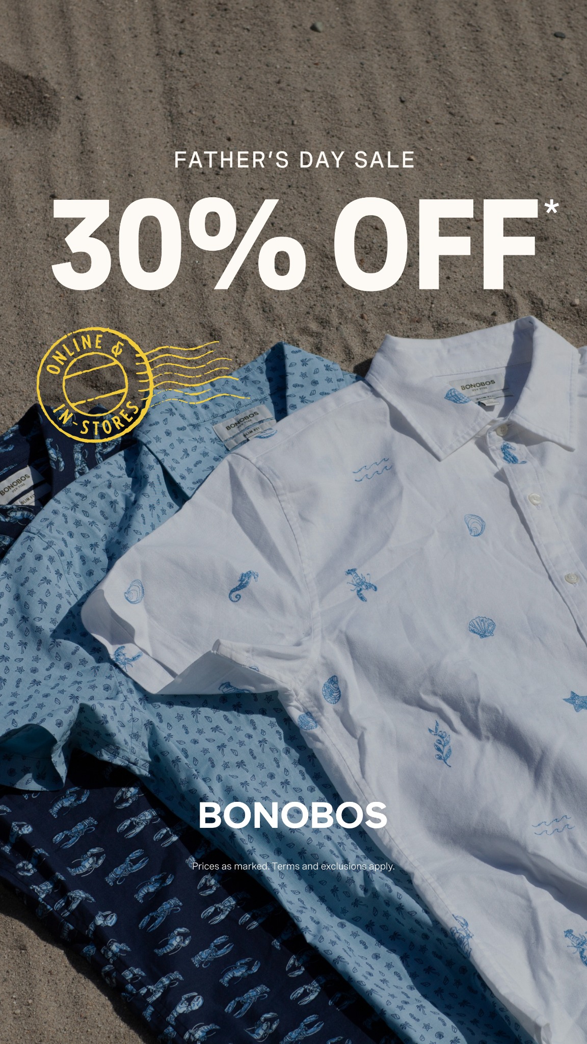
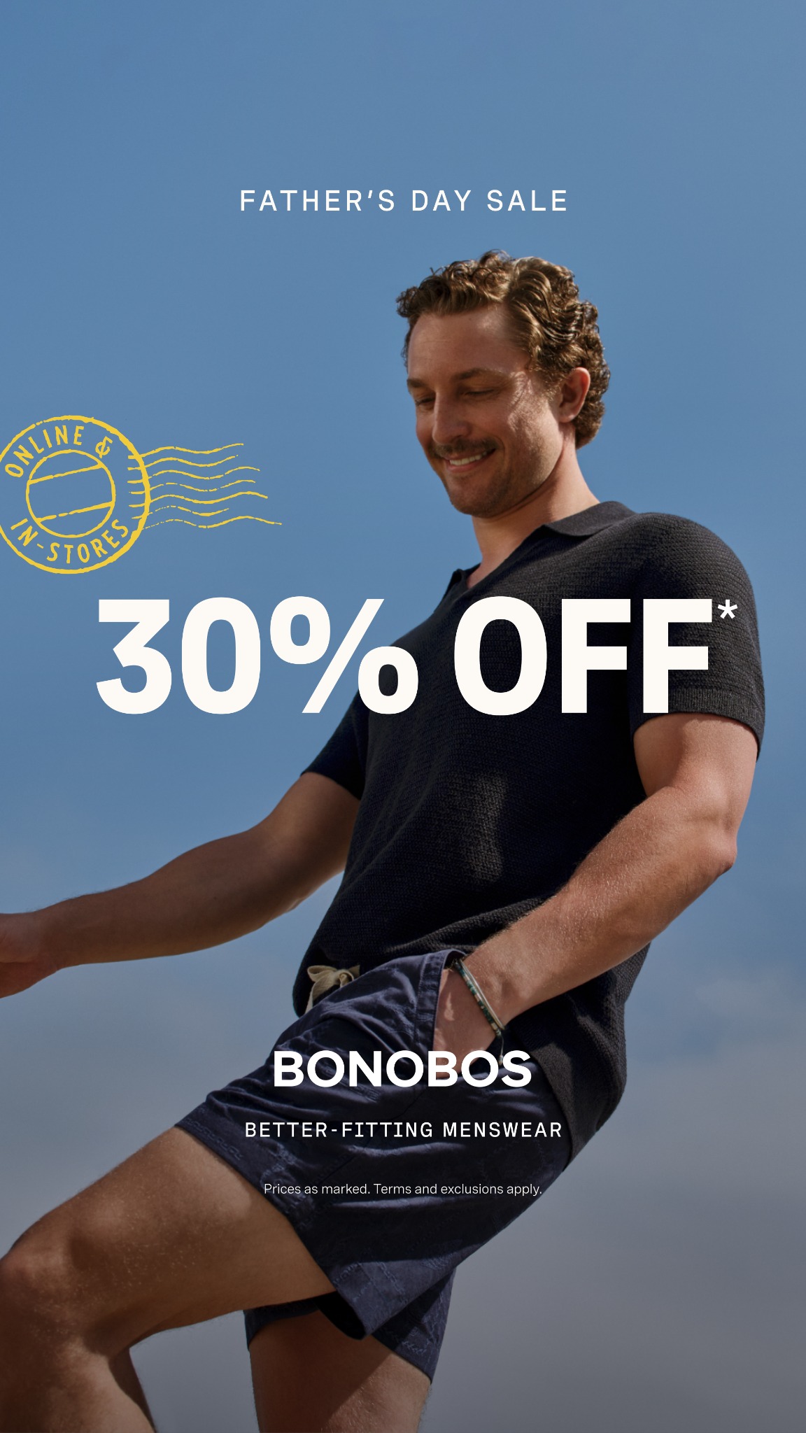
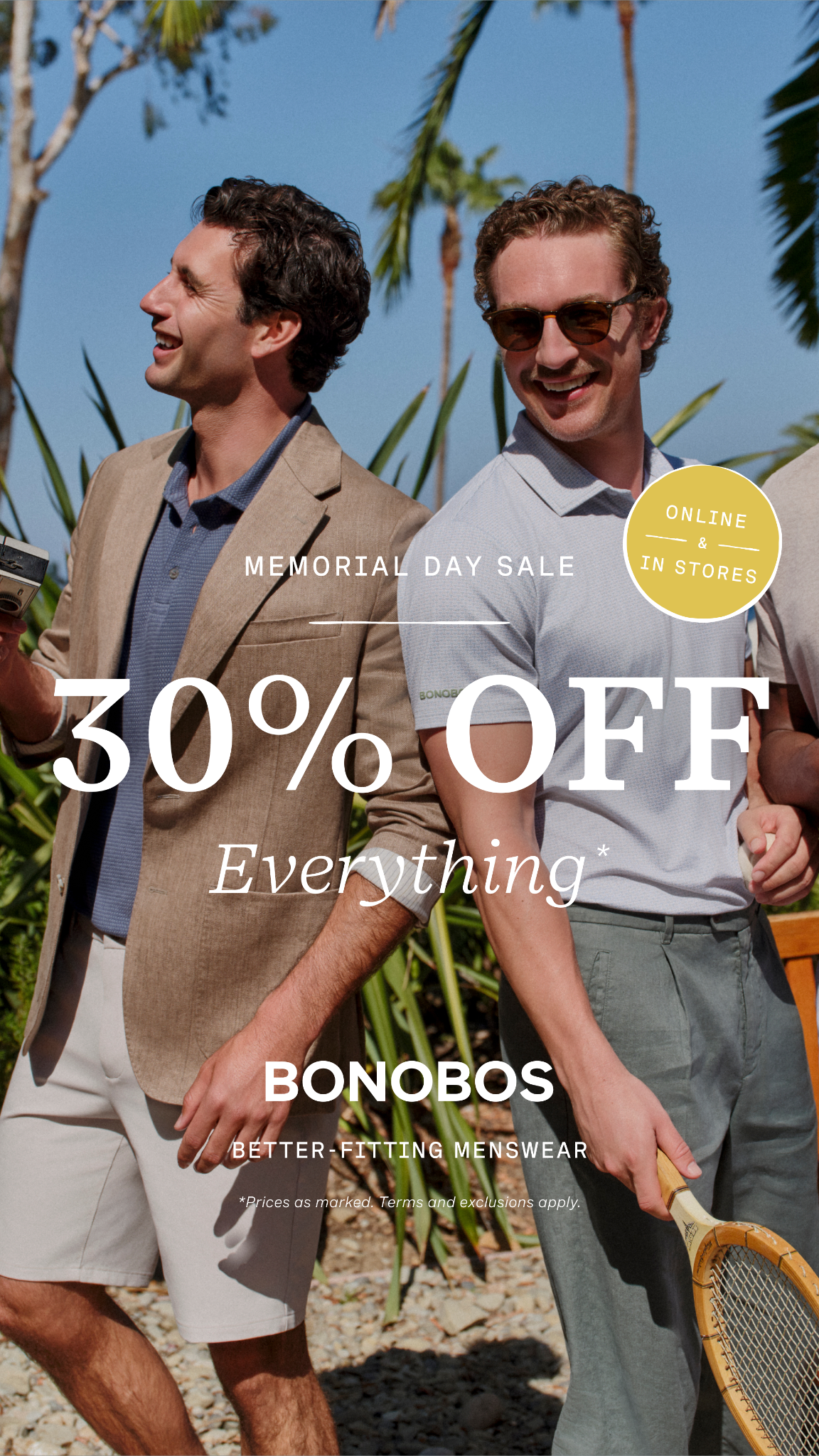
7. Bonobos — Static lifestyle hero
“Summer Collection. Everyday comfort, classic style.”


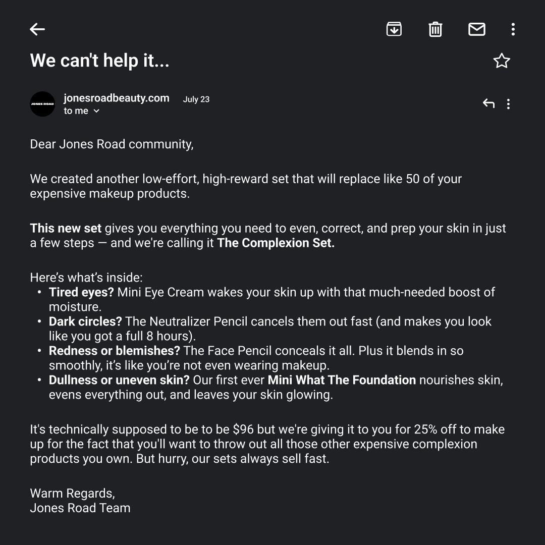
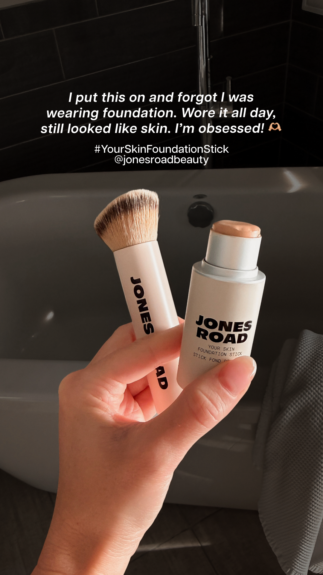
8. Jones Road Beauty — Static email screenshot
“We can’t help it…”


What 500 DTC brands actually shipped this week
Live snapshot from our Meta Ad Library tracker — refreshed nightly. Want this in your inbox every Friday? Drop your email below.
- 1111Skinskincare70 new
- 2Annie Selkehome54 new
- 3Babylon LAapparel52 new
- 4ARMRA Colostrumwellness50 new
- 5Alo Movesfitness50 new


Related reading
- The 9 Best DTC Meta Ad Hooks of 2026 — the hook layer underneath each of the templates above.
- 10 Great DTC Meta Ads With Links — the same brands as this post, plus AG1 and Ruggable, in single-ad teardown form.
- 10 Facebook Ad Library Search Tips — how to find static templates worth copying in the first place.
Browse the hand-tagged DTC swipe file
500 DTC brands. Every active ad hand-tagged with hook + angle by our editorial team. Filter by sector, by hook, by angle — or flip on “Distinctive only” to drop the saturated 85% of feed-standard creative. Updated daily, no signup required.
Open the swipe fileOr get email alerts when these brands change creative
The DTC watchlist tracks the brands above and emails you when their Meta ads change. One page, no account needed.
See the watchlist